


An e-commerce landing page is a standalone page designed for one specific goal and audience, who arrive directly after clicking a link in a search result, a paid ad, or a marketing email.
Its primary goal is to drive conversions. This distinguishes them from product pages and homepages, which are more informative and allow the shopper to explore the product and the brand’s offerings.
Brands run four kinds, depending on where the visitor sits in the funnel: top-of-funnel pages that bring potential customers to your online store, mid-funnel pages that push sales, bottom-of-funnel pages that close sales and drive cross-sells and upsells, and post-purchase pages that nurture long-term relationships.
Best-converting landing pages share the same key elements: one offer and one CTA, a persuasive message aligned with the ad, social proof to build trust, and quality visuals.
This article pulls apart eight real e-commerce landing pages and turns what they get right into a list of landing page best practices. I also explain how to use analytics tools like Crazy Egg to inform landing page design.
What Is an E-commerce Landing Page?
An e-commerce landing page is the page of a website the visitor arrives on after clicking an external link, for example, in a promotional email or an advert,
A landing page is created for a specific marketing purpose: it has one offer, focuses on one conversion goal, and targets one specific audience.
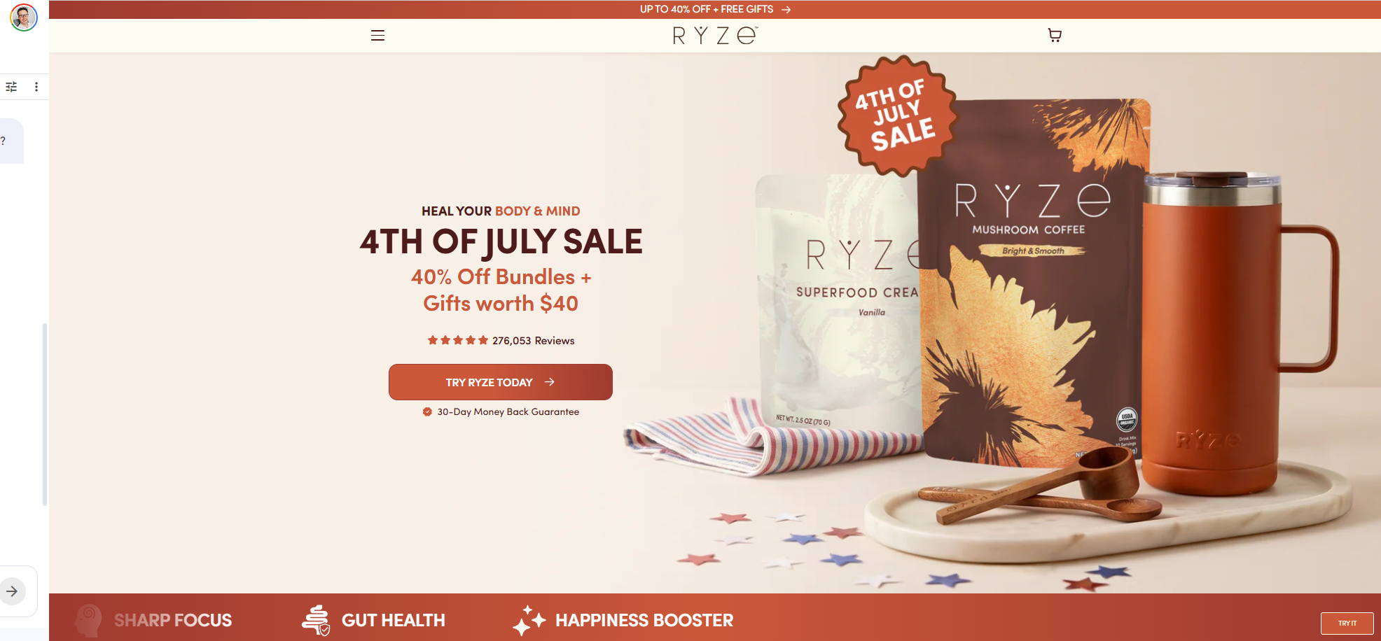
For example, the Ryze landing page targets cold traffic unfamiliar with mushroom coffee and is designed to drive bundle sales in a 4th of July promotion campaign.
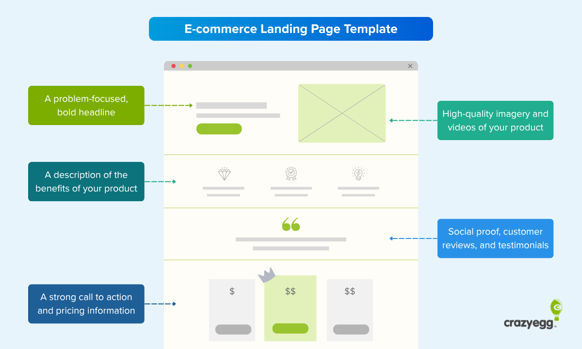
E-commerce landing page elements
Most high-converting landing pages include these elements:
- Above-the-fold content. What a visitor sees before scrolling: a headline, a supporting line, a hero image or video, and a visible CTA.
- Persuasive copy. Written in your brand voice, leading with the benefit (“Improved digestion”), not the feature (“organic ingredients”).
- Imagery and brand identity. A consistent color palette, type, and logo, and high-quality images.
- Social proof. Star ratings, customer reviews, customer testimonials, press logos, and customer photos.
- Call to action. One primary CTA, written as an outcome, repeated throughout the page.

- Skimmable elements. Bullets, tables, star ratings, a short demo video, trust seals, and more.
Here’s a typical e-commerce landing page template:
Landing page vs. product page vs. homepage
A homepage is the main page that tells the brand story and routes visitors to different website areas, while a product page (PDP) provides detailed information, specifications, and reviews for a specific item that help store visitors decide.
In contrast, a landing page is a standalone page designed to focus targeted traffic on one specific action.
Homepages and product pages encourage exploration, while landing pages are optimized for direct conversions from specific campaigns.
Types of landing pages
Landing pages serve different purposes, depending on where the visitor sits in the funnel.
Here are four examples:
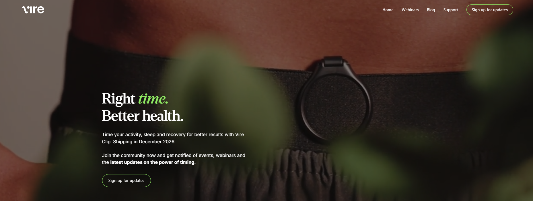
- Top-of-funnel (awareness) pages introduce the brand and product to new visitors and capture the lead, but not always close a sale. Like the Vire landing page, designed to capture pre-launch interest.
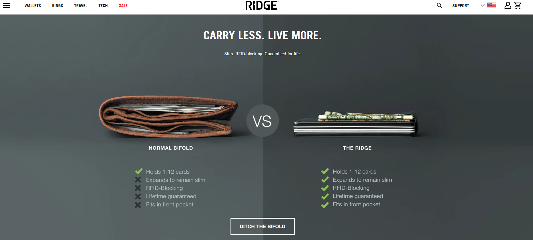
- Mid-funnel (consideration) landing pages nudge visitors towards conversion by educating them about product benefits, sharing reviews, and comparing to alternatives. Ridge’s “Ditch the Bifold” page does this by pairing a side-by-side comparison with benefit-focused copy.
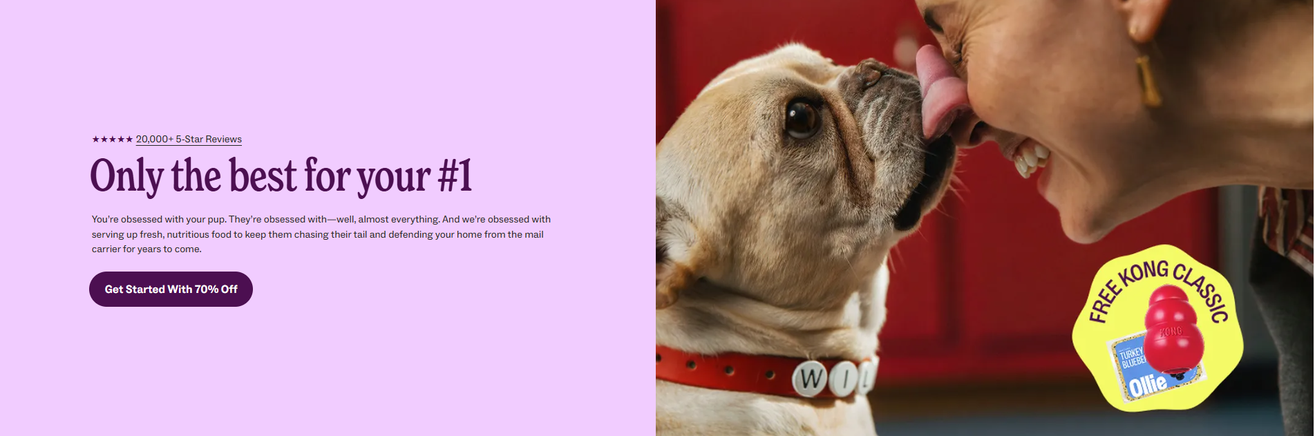
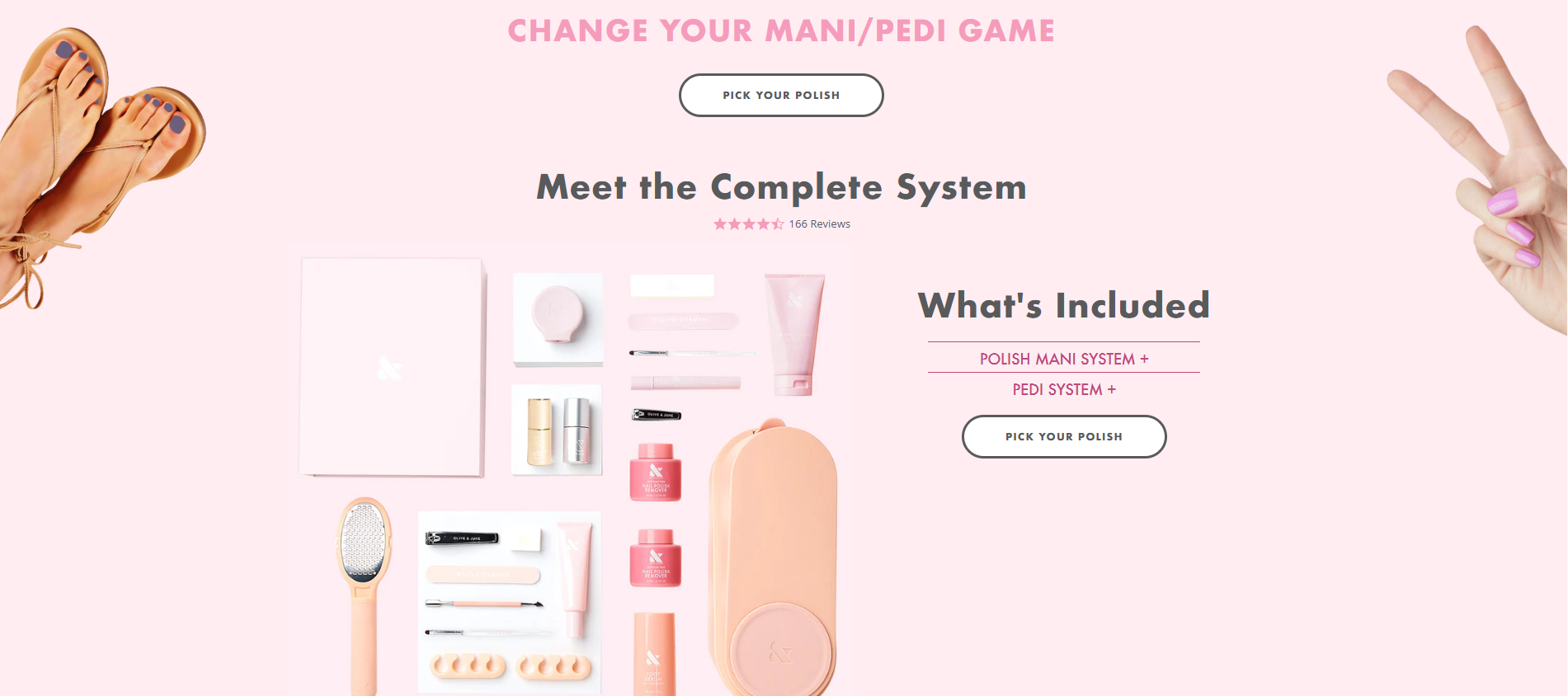
- Bottom-of-funnel (decision) landing page targets buyers in a purchase mind frame. They close the sale and increase the order value with cross-sells and upsells. For instance, Olive and June drive the AOV up with mani and pedi bundles, which wouldn’t work if the customer weren’t ready to purchase the polish first.
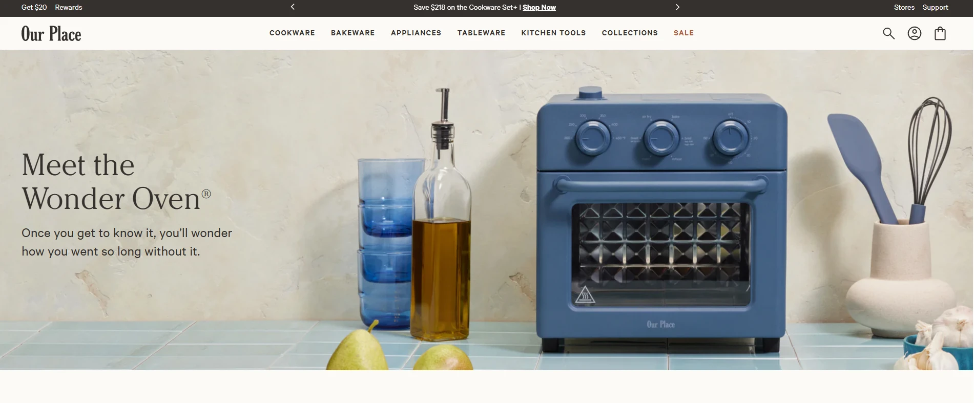
- Post-purchase (retention) landing pages drive repeat purchases and referrals and nurture the customer relationship. For example, Our Place’s Wonder Oven page uses how-to videos, recipes, and troubleshooting FAQs to help customers get the most out of their new appliance.
8 High-Converting E-commerce Landing Page Examples
Here’s a break down of eight landing pages, each illustrating a specific aspect of landing page design.
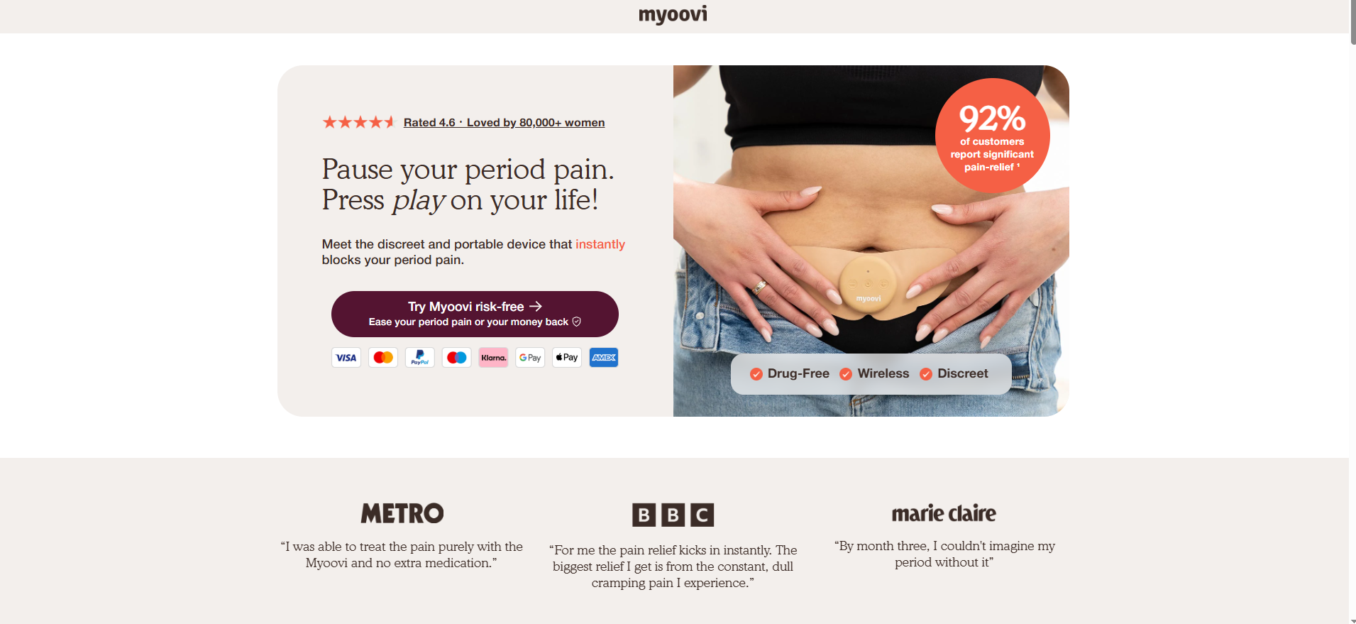
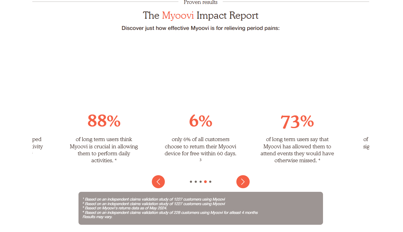
Myoovi
Myoovi layers risk reversal and social proof throughout he landing page for its period-pain TENS device.
The company offers a no-questions-asked return policy with a 60-day money-back guarantee and free returns, and the CTA (“Try Myoovi risk-free, ease your period pain or your money back”) reinforces the promise and reassure the visitor at every conversion point.
Other trust-building features include:
- The aggregate review rating and review count in the hero (4.6 rating, 80k+ customers).
- Press logos below the hero section (Metro, BBC, Marie Claire).
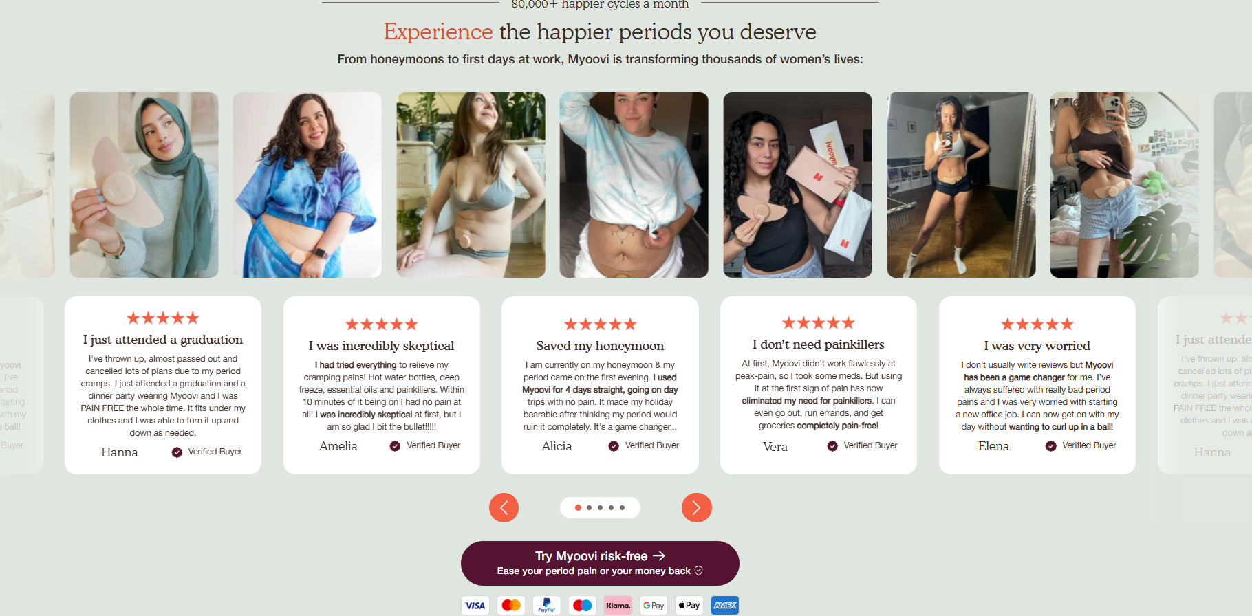
- UGC photos and verified customer reviews.
- Stats from Myoovi’s Impact Report demonstrating the device’s positive impact.
- Credit card logos next to the CTA.
I also like how Myoovi uses images and videos of the product in use and the clever headline “Pause your period pain. Press play on your life!” (I’m a sucker for a good alliteration).
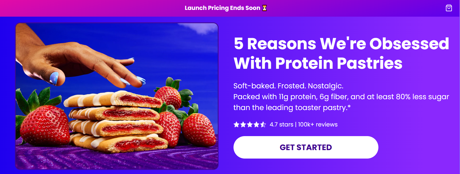
Magic Spoon
Magic Spoon’s protein-pastry product landing page leans on data and educational content to build trust and convert customers.
The hero includes nutritional data (11g protein, 6g fiber, 80% less sugar) and the page is structured as a listicle (“5 Reasons We’re Obsessed With Protein Pastries”) that reiterates the product’s nutritional benefits.
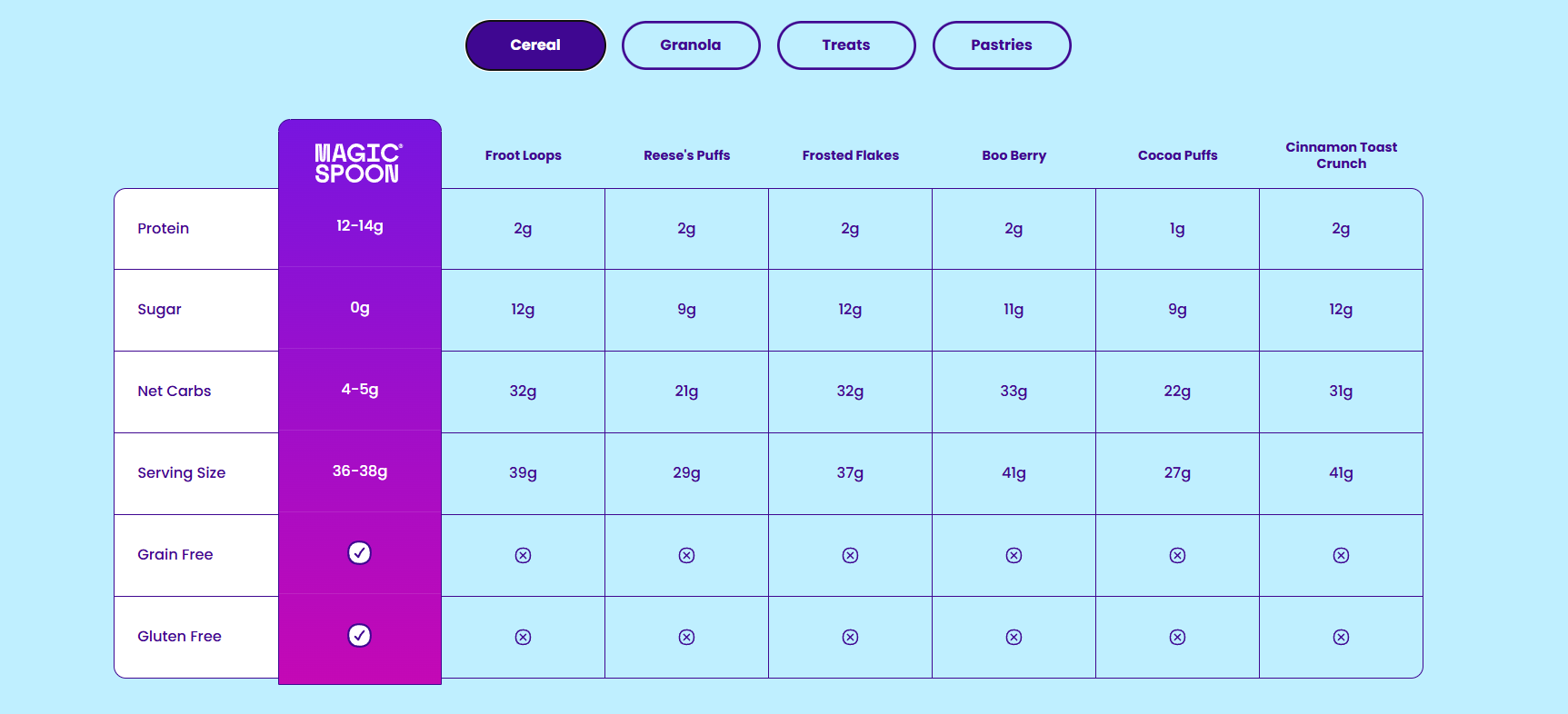
A comparison table backs it up by pitting Magic Spoon against named competitors on protein, sugar, and net carbs. Naming specific brands makes the comparison more convincing than a generic “vs others.”
The page closes with an FAQ section that tackles the most common consumer enquiries and concerns, including (“Why is this more expensive than “regular” breakfast options?”).
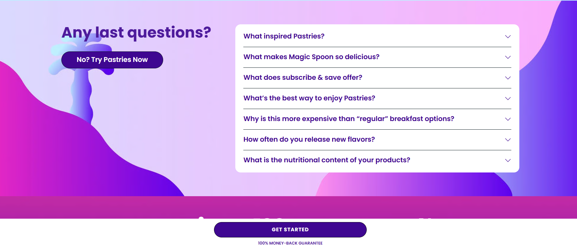
The whole page is stripped of all nav elements down to a single cart icon, and a sticky “Get Started” button with “100% money-back guarantee” microcopy.
Nature’s Menu
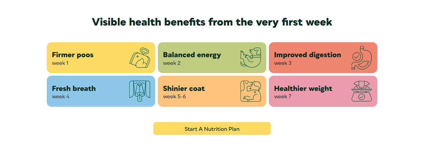
Nature’s Menu’s raw dog-food landing page leads with the offer (“40% off your first box + free treats and delivery”), a Trustpilot 4.1 from 6,011 reviews, and three benefit checks (80% meat, easy portions, results in 7 days), all above the fold.
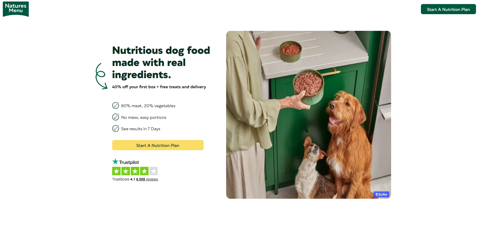
That “results in 7 days” links to the week-by-week timeline further down the page.
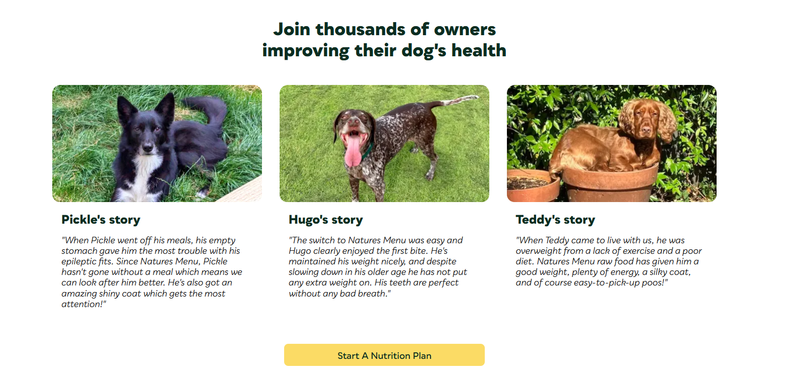
But the biggest Nature’s Menu page strength is the social proof.
Real-dog owner testimonials describing specific outcomes (shiny coat) and addressing common pain points (lack of appetite, bad breath, etc.) prove that the meal plans work.
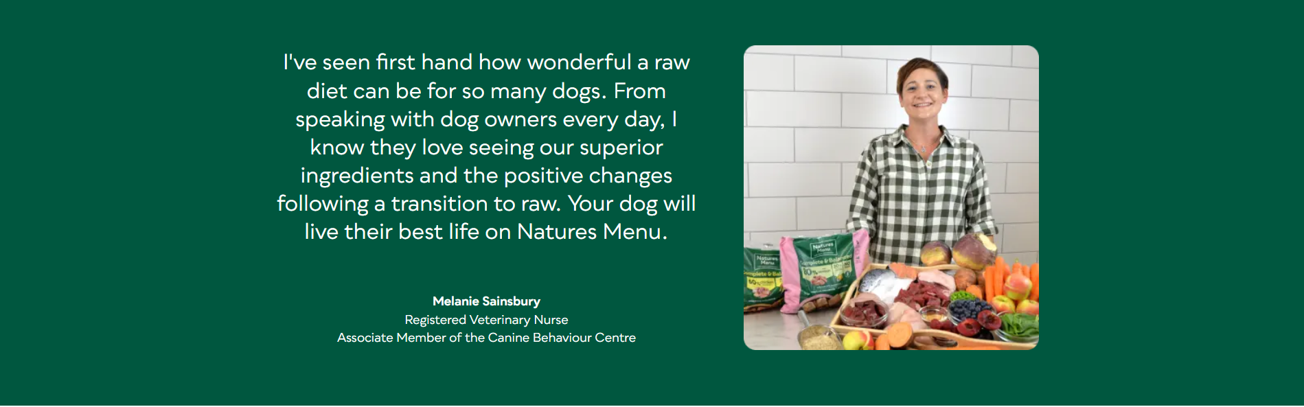
And if that’s not enough, a named expert endorsement from a veterinary nurse lends professional authority. For a product that affects an animal’s health, a vet’s credibility carries more weight than another customer review.
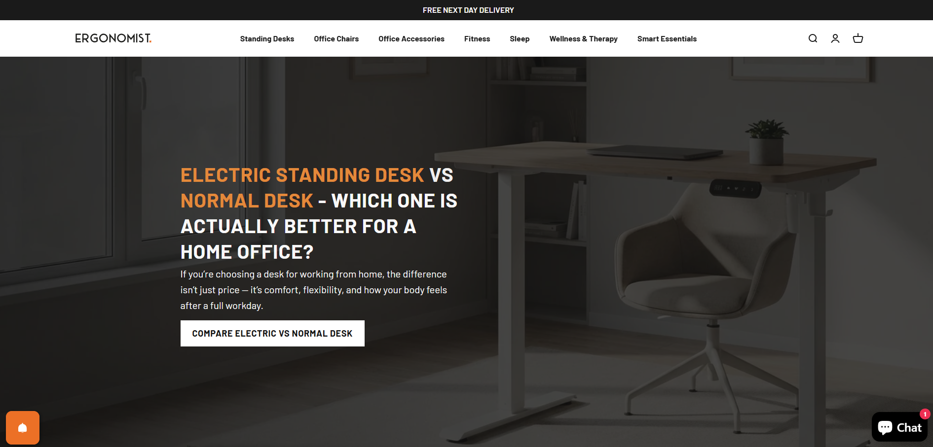
Ergonomist
Ergonomist’s mid-funnel landing page leads the vistor from the search query to the purchase module.
It opens with a headline that matches the question a potential buyer would type into Google or an AI chatbot when researching products: “Electric Standing Desk vs Normal Desk, which one is actually better for a home office?”
The CTA, “Compare Electric vs Normal Desk”, is consistent with the page format and encourages further exploration.
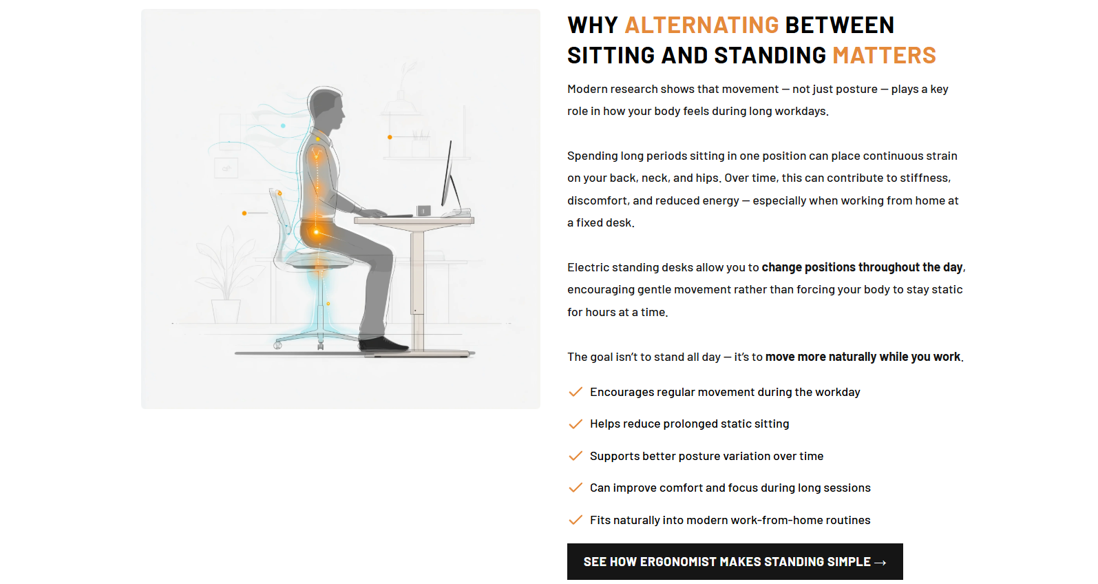
The page consistently builds the case by addressing five problems with normal desks (back pain, poor posture, etc), then explains the health benefits of alternating between sitting and standing.
Only when the customer understands they need a standing desk does the page move to product-specific benefits and social proof to convince them they need the Ergonomist desk.
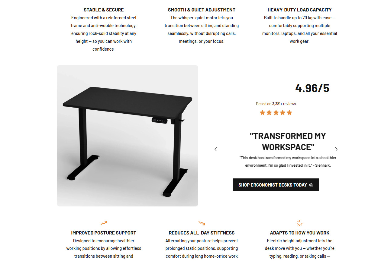
This leads to the product buy module enabling the shopper to configure and purchase the desk without leaving the page, which reduces the drop-off risk.
Eight Sleep
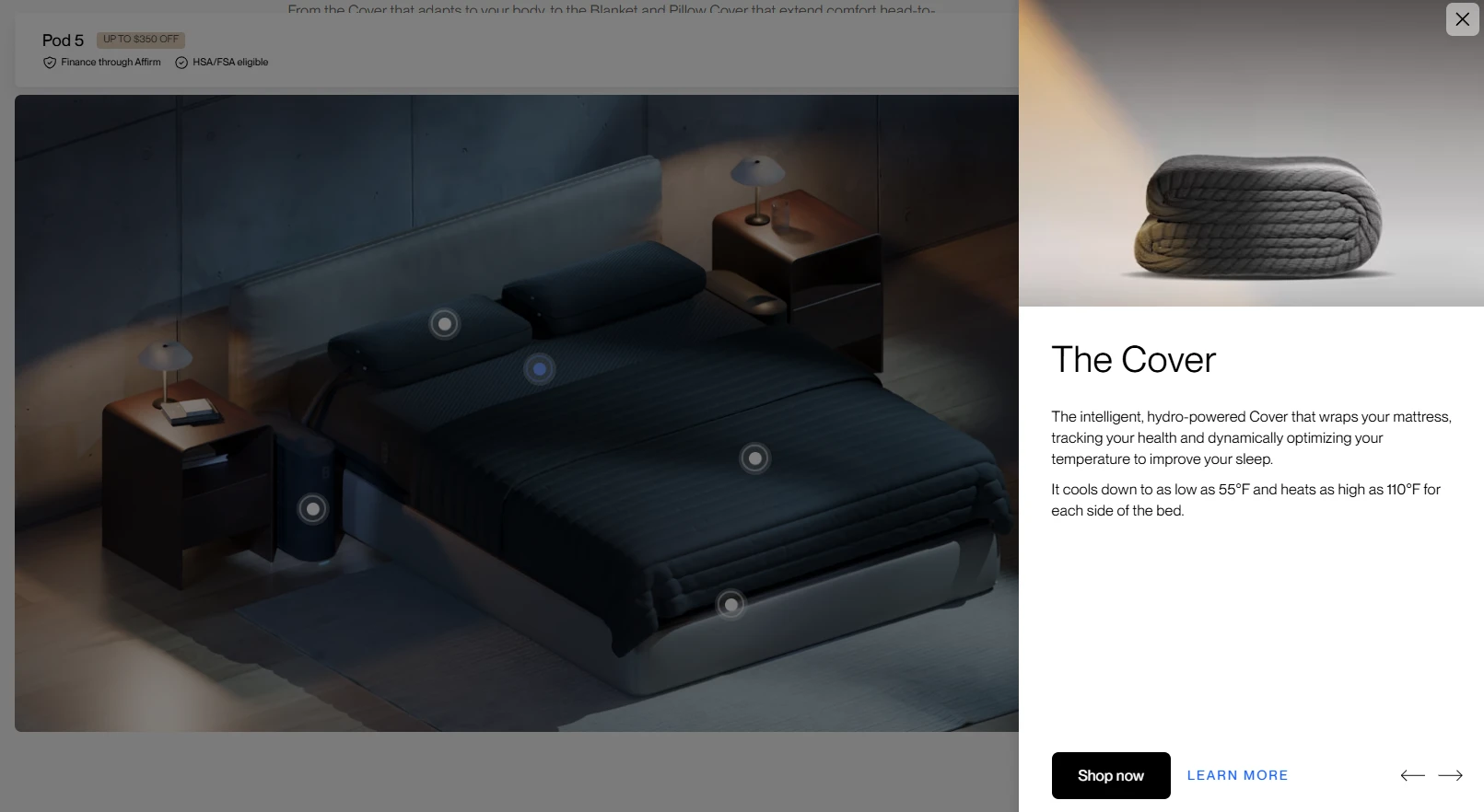
Eight Sleep’s landing page stands out because of its interactive nature and how it builds credibility.
The clickable hotspot explorer lets shoppers learn about each component of the sleeping system, each with its own product photo, description, and CTA.
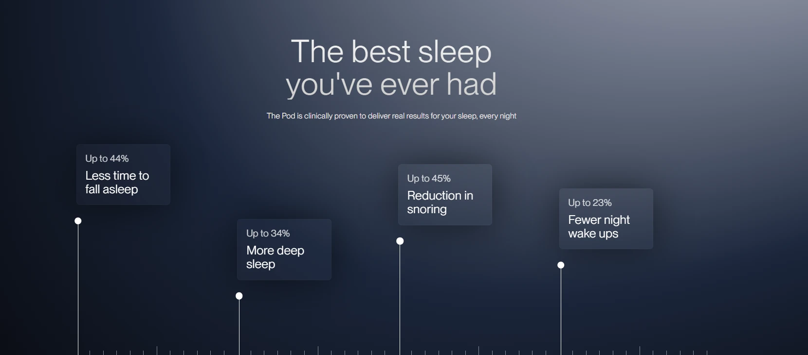
To establish credibility, the benefits section backs the “clinically proven” claim with specific numbers (44% less time to fall asleep, 34% more deep sleep, etc).
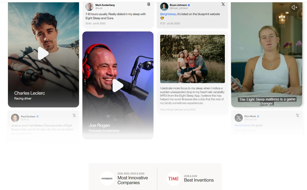
A celebrity and influencer wall mixing video testimonials (Leclerc, Rogan) and social posts (Zuckerberg, Musk, Bryan Johnson, Paul Graham) and industry awards (Fast Company “Most Innovative Companies”, Time “Best Inventions”) follow.
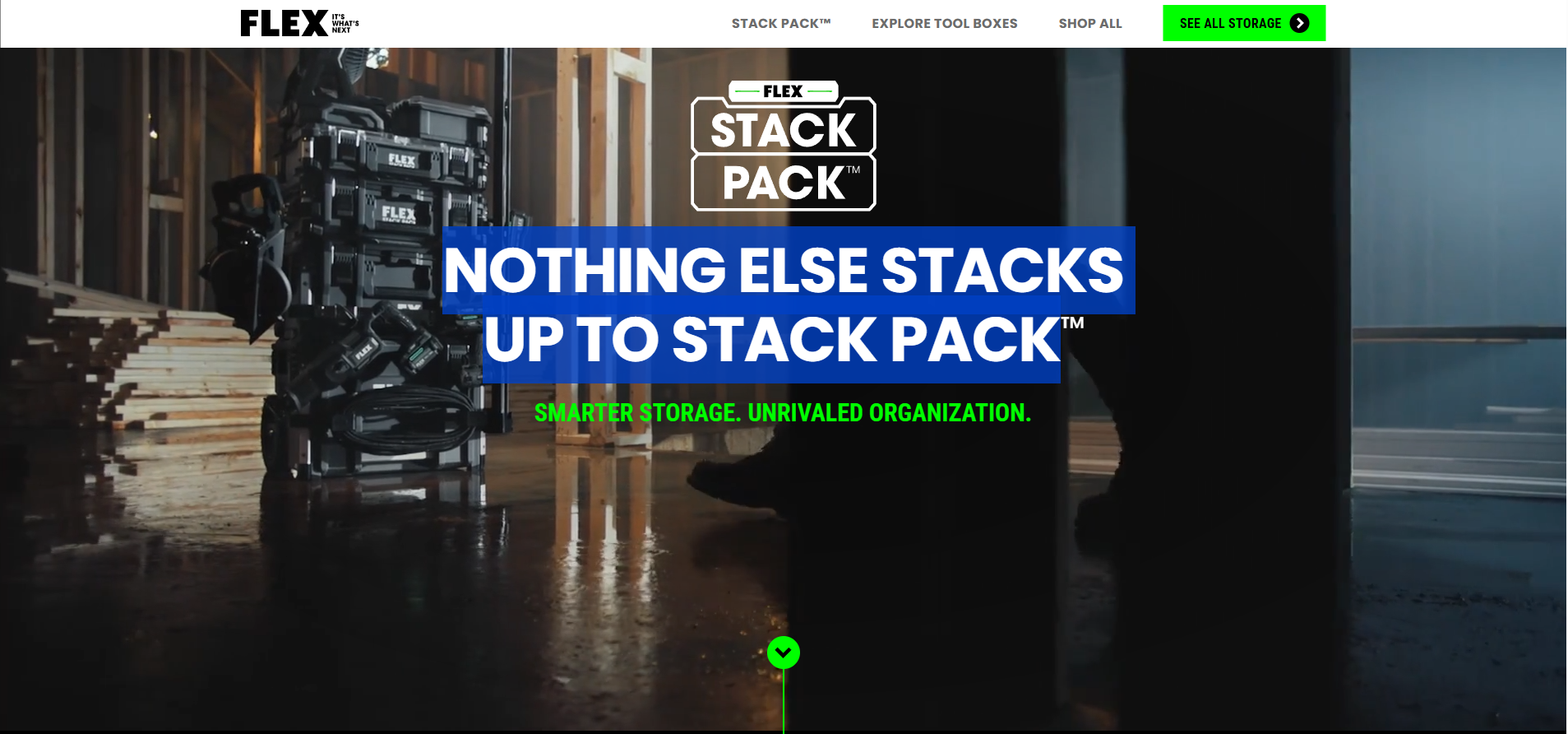
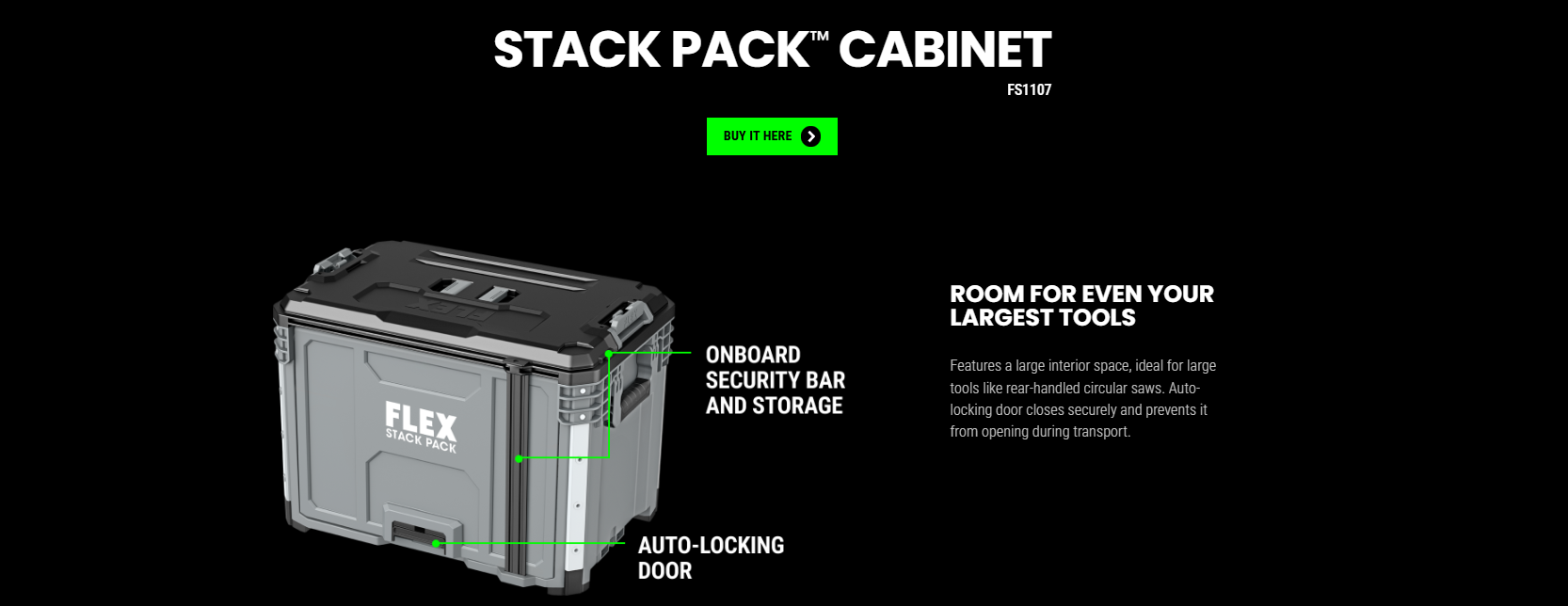
Flex
FLEX’s landing page for its modular tool storage system features a full-width video of the product in action and an animation that showcases its key benefits.
The headline “Nothing Else Stacks Up to Stack Pack” is a benefit claim and a product-name pun in one line.
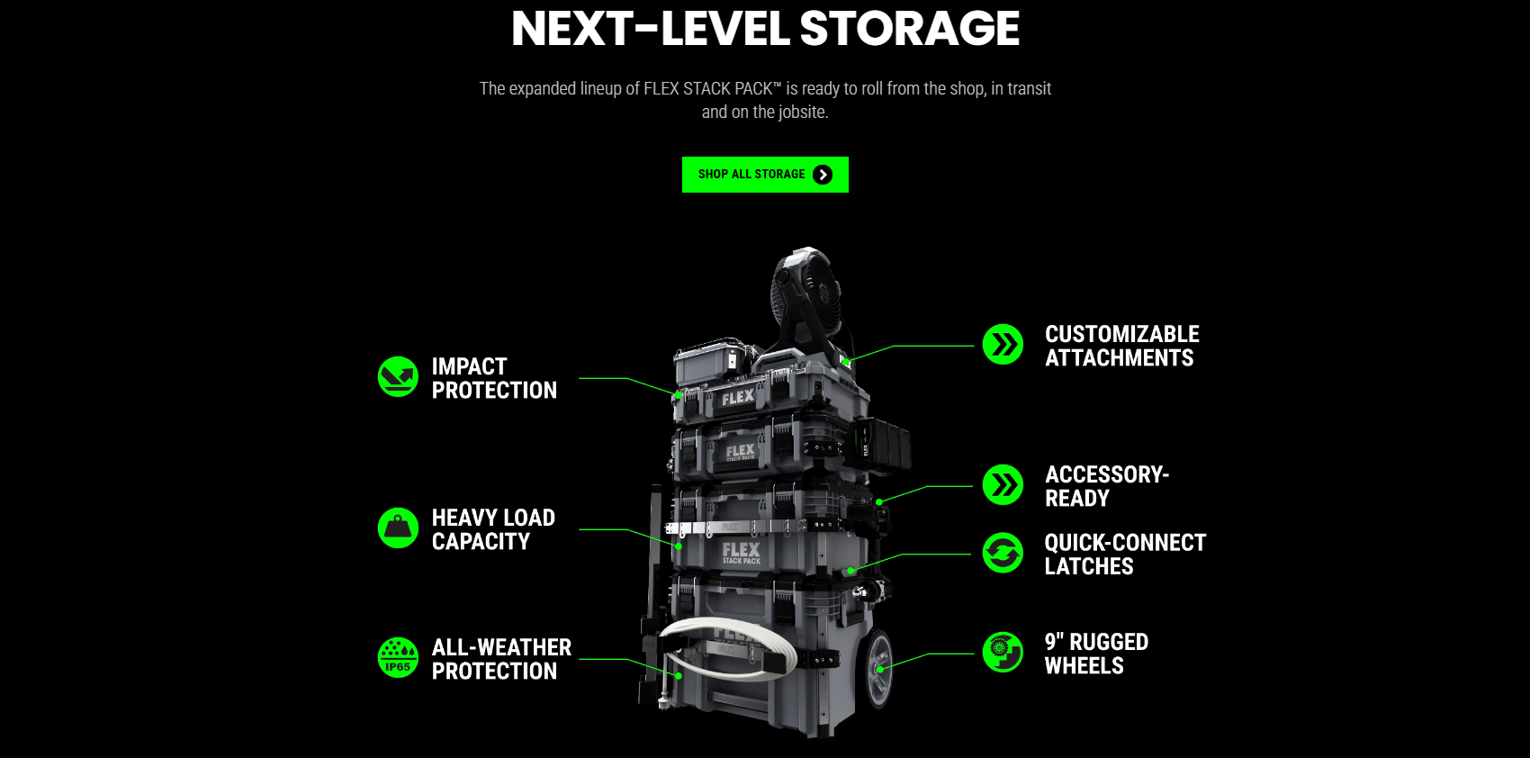
From there, the page walks through each piece using annotated product images with callout lines pointing to specific features.
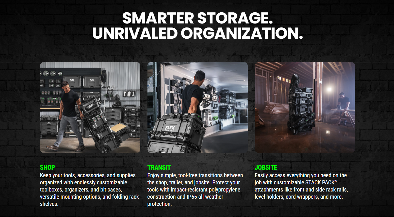
The Shop / Transit / Jobsite section frames the system around where the buyer uses it, with photos showing the Stack Pack in each setting.
Bachan’s
Bachan’s “Welcome Costco Fam” landing page focuses on retention and cross-sells. It targets shoppers who already bought a bottle of their Japanese barbecue-sauce in-store and uses recipes and brand storytelling to strengthen the relationship.
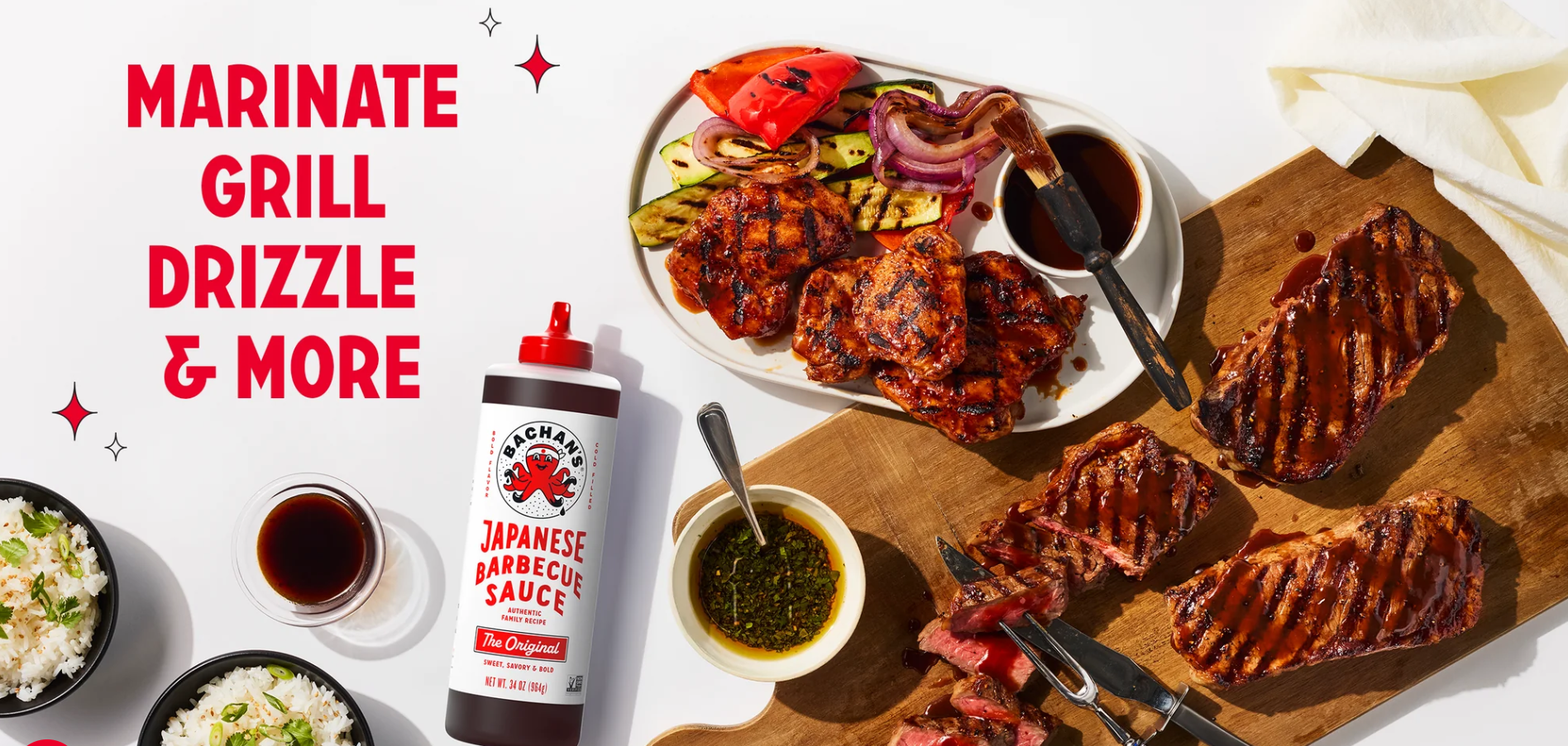
The page leans heavily on visual content (we eat first with our eyes, after all):
- Food photography and a recipe carousel giving the buyer immediate use cases.
- The founder section featuing Jason and his grandmother and connecting the product to a multi-generational story.
- Ingredient illustrations breaking down what goes into the sauce.
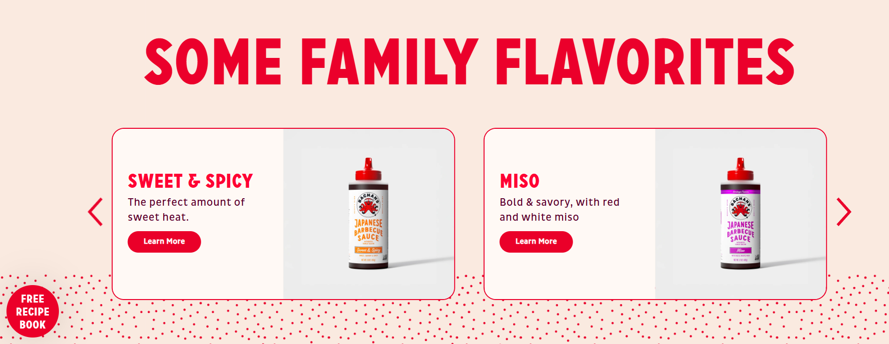
The content-first page deepends the customer relationship and leads to related product recommendations brilliantly called “flavorites.” These are the only commercial CTAs on the page and their job is to drive cross-sells.
Maëlys
Maëlys uses a 5-step product-finder quiz as its landing page for body-care shoppers.
Instead of browsing a product grid or filtering search results, the visitor answers five questions and gets a personalized recommendation.
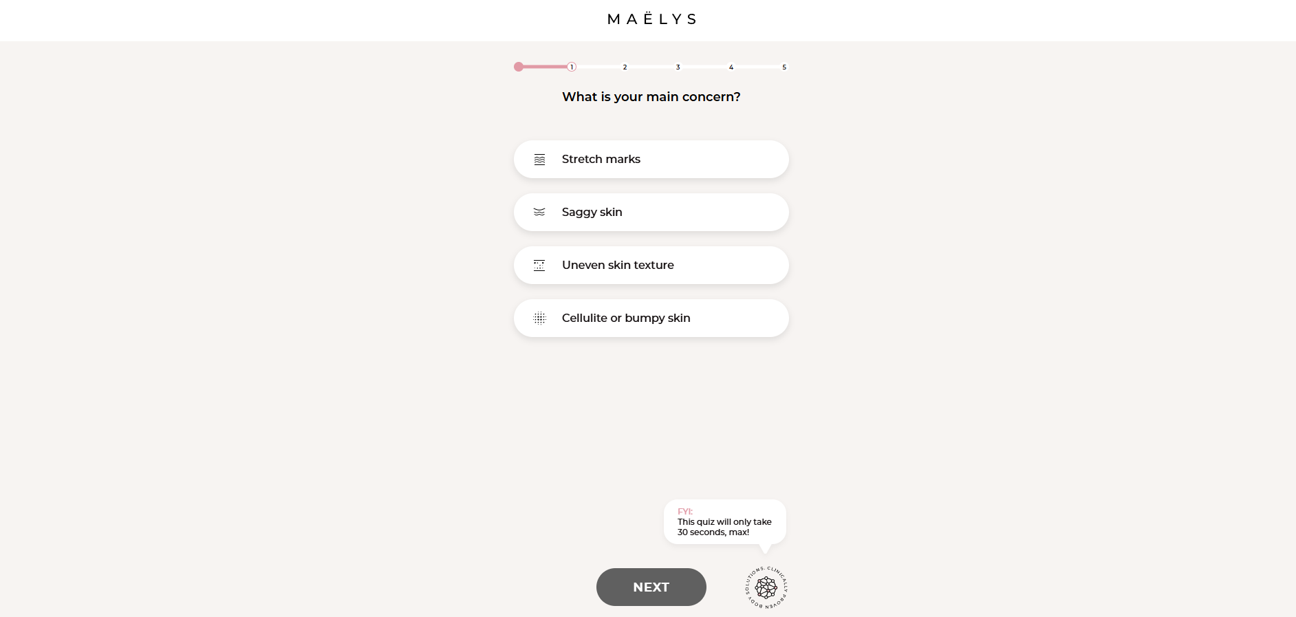
By gamifying the shopping experience, the quiz, paired with the progress bar, makes it more engaging and draws the user in. Each completed step increases commitment and makes it harder to abandon (the page is stripped of any other nav, so there’s no clear exit ramp anyway).
The only friction comes after the final question: to see the results, the shopper needs to provide their email address, which turns the quiz into a lead-capture tool.

If this doesn’t put them off, they get product recommendations tailored to their unique needs.
How to Build a High-Converting E-commerce Landing Page
Using the examples as a foundation, I’ve put together a list of landing page design best practices.
1. Match the page to the ad. If the ad says “30% off your first box,” the copy says the same. If the ad has a tone or a visual, the page mirrors it. Landing somewhere that looks or sounds different from the ad makes the visitor wonder if they’re in the right place and causes friction.
2. Put your unique value proposition in the hero. Clearly explain why this is worth their time over the alternatives. For example, “Nutritious dog food made from real ingredients”.
3. Capture attention above the fold. Make the headline, hero image, and primary CTA instantly visible without scrolling (also on mobile).
4. Show the product working. Display images of the product in use, on a real person, in a real setting. Add videos to make the page more engaging and better demonstrate how the product works.
5. Display social proof throughout the page. Embed the aggregated product rating in the hero, place logos just under the hero, follow with selected reviews or testimonials, and add a full review section at the end of the page.
6. Name the outcome in the CTA. “Claim my discount” is better than generic “Submit” because it naturally follows the promise in the headline. Keep one primary CTA, and make any secondary link less prominent — if you must have one.
7. Remove the navigation and competing CTAs. Stripping the menu and navigation elements closes exit points and funnels the visitor towards the conversion.
8. Use real urgency and scarcity. A specific, genuine deadline, like “Ends on Monday, 6th of July,” works better than a vague “ends soon.” Fake countdowns and “limited-time” deals that never end, on the other hand, undermine trust.
BONUS: Build for mobile first. Use a single-column design, 16+ font size, 48×48 tap targets, and a sticky CTA, so mobile users can easily navigate the page. Most e-commerce traffic comes from mobile devices.
Analyze and Improve Your Landing Page
While following best practices is a good starting point when designing your e-commerce landing pages, the only way to be certain about what works and what doesn’t is to track the page’s performance and analyze users’ engagement.
Here’s what I would do:
- Track conversions. Set conversion events in your analytics tool and monitor how many users complete them. Break down the results by device (mobile vs. desktop) and traffic source (emails vs. PPC vs. organic), so you know who you’re optimizing for.
- Read heatmaps and scroll maps. Heatmaps show where clicks land, and scroll maps how far people get. Use them to see which sections of the page users engage, and which they scroll past.
- Watch session recordings. Analyze the behavior of individual users who left without converting. Watch for friction signals, like rage or dead clicks.
- A/B test design elements. Use the insights from heatmaps and recordings to formulate hypotheses and run split tests to find layout, headline, or copy variants with the highest conversion rates.
You can track conversions, analyze heatmaps and session recordings, and run A/B tests with Crazy Egg. Sign up for the free 30-day trial now.
Frequently Asked Questions
Do I need a landing page if I only sell one product?
Whether you need a landing page doesn’t depend on the number of products you sell, but on your marketing efforts. If you run various campaigns targeting buyers at different stages of the funnel, you will benefit from dedicated landing pages. For example, you can have a unique landing page for every seasonal promotion, traffic source, or customer segment.
How many e-commerce landing pages do I need?
As a rule of thumb, you need one e-commerce landing page per major traffic source or marketing campaign. For example, if you run an end-of-summer sale and back-to-school bundle offers, each should have a dedicated landing page.
Will a dedicated landing page hurt my SEO?
A landing page can hurt your SEO if it ranks for the same keywords as your organic pages (cannibalization). The easiest way to prevent it is by setting your paid-traffic landing pages to noindex and targeting your SEO landing pages at keywords your main pages aren’t already ranking for.
How long should an e-commerce landing page be?
Most of the analyzed landing pages consisted of 5-8 screens. However, a couple were as short as 3 screens, and a few went beyond 15 screens. The length depends on the product complexity and the funnel stage. A short landing page may be enough to convert warm, high-intent traffic. Complex or high-consideration products need longer pages for technical specs, objection handling, comparison, or proof.